Data Presentation - Dot Diagram
A dot diagram, also called a dot plot, is a statistical chart consisting of data points plotted on a fairly simple scale. Dot plots are one of the simplest statistical plots, and they are usually used for small data sets. They are useful for highlighting clusters, gaps, skews in distribution, and outliers. When dealing with data sets larger than 20 or 30 points, it might be better to use another chart type, such as a histogram, since the dot plot will become crowded.
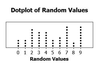
 A dot plot of 50 random values from 0 to 9. Source: wikipedia
Making a Dot Diagram
In a dot plot, data points (dots) are stacked in a column over a category. The height of the column represents the frequency of observations in a given category. In the dot plot above, the categories are the numbers \(0\) through \(9\). \(1\) occurs three times, and \(6\) occurs four times.
A dot plot has information about the total number of data points and how they are distributed among certain categories.
The dot plot below describes the number and types of pizzas ordered for a party. By analyzing the dot plot, determine how many pizzas were ordered for the party. How many of these pizzas were cheese or pepperoni?

Answer: To find the total number of pizzas, add together all of the data points on the dot plot. In total, there were 22 pizzas.
To find the number of pizzas in certain categories, add up all of the data points in those categories. There are 5 cheese pizzas and 7 pepperoni pizzas, so 12 pizzas are cheese or pepperoni.
When are vacations most popular? Below are the results of a survey sent out to 7th year students about when they go on vacation with their family. From the results below, is there a most popular time frame that students go on vacations?

Answer: From this dot plot, we can see that most vacations occur during June, July, and August (in the northern hemisphere, these correspond to the summer season).
A survey was taken in an apartment complex to determine how many computers each family owns. A dot plot was made with the results. Looking at the dot plot below, determine if there is a skew in the data and if so, describe it.

Answer: Since this data is numerical, we can find meaningful skews in data if they exist. Since most of the data points are on the left, and there are few data points on the left, this dot plot displays a right skew. This shows that most families in the apartment complex have between 1 and 3 computers.
